> git clone https://github.com/taigaio/taiga-back.gitDS - Matplotlib - Basic charts
Still looking into data representation, this time I’m digging a little bit more on Matplotlib and how to improve my charting kunfu. Still in the basics reviewing some basic charting types.
Getting some data
A week ago my dear workmate @alotor reminded me of the book Your code as a crime scene by Adam Tornhill, which I strongly recommend to anyone. In this book the author uses git and some other system tools to get information from software projects and then do some data analysis on them. In this article I’m using the source code from the backend of Taiga, an open source project by Kaleidos. Taiga is, following the project’s site definition: the management tool for multi-functional agile teams.
clone Taiga
Scatter plot
Most of the time is used to show the relationship between two different variables using cartesian coordinates. For example, lets see which days and hours the people works the most on Taiga. There will be two variables: one axis will be the days and the other will be hours. First I’m extracting the information required from git:
creating csv
git log --pretty=format:"%h;%ae;%aI" > /tmp/commits_with_datetime.csvAfter loading the file into Jupyter you can then read the csv file:
Loading csv file
import pandas as pd

by_datetime = pd.read_csv('commits_with_datetime.csv', sep=';', names=['hash', 'email', 'datetime'])
by_datetime.head()
Now lets create two columns in the dataframe for day of the week and hour of the day:
splitting datetime from commit hours
from datetime import datetime as dt

by_datetime['datetime'] = pd.to_datetime(by_datetime['datetime'], utc=True)
by_datetime['weekday'] = by_datetime['datetime'].dt.weekday
by_datetime['hour'] = by_datetime['datetime'].dt.hour

august_to_september = (
    (by_datetime['datetime'] > dt.fromisoformat('2020-08-12T00:00:00+02:00')) &
    (by_datetime['datetime'] < dt.fromisoformat('2020-09-01T00:00:00+02:00')))

last_month = (by_datetime
    .copy()
    .loc[august_to_september]
    .loc[:, ['datetime', 'hour']]
    .sort_values('datetime'))

last_month.head()
Now we can create a scatter plot showing the commits distribution in August 2020. Apart from only showing the points I’m also highligthing which commits were done during working hours from those done during people’s own time.
Creating the scatter plot
import matplotlib.pyplot as plt
import numpy as np
from datetime import timedelta, datetime as dt

# SCATTER DATA
xs = last_month['datetime']
ys = last_month['hour']

plt.figure(figsize=(15, 5))

# SCATTER PLOT
plt.scatter(xs, ys)

# TITLE AND LEGEND
plt.title('COMMITS DISTRIBUTED BY HOURS OF THE DAY (AUGUST 2020)')
plt.legend(['commits'])
plt.ylabel('HOURS (GMT +02:00)')
plt.grid(axis='x')

# DASHED LINES SHOWING WHERE THE WORKING HOURS START AND END
since = xs.min()
until = xs.max()

plt.hlines(y=8, xmin=since, xmax=until, linestyle='--', alpha=0.2, color='black')
plt.hlines(y=15, xmin=since, xmax=until, linestyle='--', alpha=0.2, color='black')

# WORKING OURS RANGE
plt.gca().fill_between(
    xs,
    15,
    8,
    alpha=0.5,
    color='#9ac9dc')

# WORKING HOURS CAPTION
plt.text(until - timedelta(days=0.5), 11, s='WORKING HOURS', size=18, ha="right", c='gray')

# MAKE THE BLUE AREA TO COVER THE WHOLE X AXIS
plt.margins(x=0)

# MAKING Y AXIS TO START AT ZERO
plt.yticks(np.arange(0, 28, step=4))

plt.show()
Here’s the result:
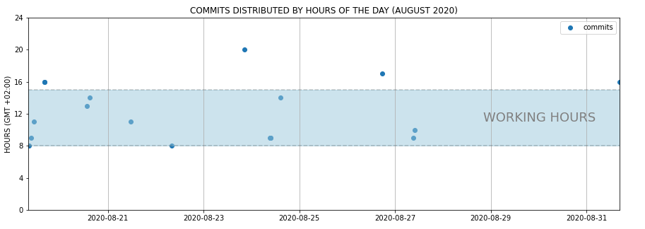
Figure 1. Scatter plot showing how commits are distributed by daily hours
A possible insight between days and hours would be that many of the commits in August were done at the beginning of the month, during working hours.
to show the relationship between two different variables
Takeaways
-
Include more variables, such as different sizes, to incorporate more data.
-
Start y-axis at 0 to represent data accurately.
-
If you use trend lines, only use a maximum of two to make your plot easy to understand.
Resources
-
Scatter Plot on Wikipedia
-
Scatter Plot: How to Choose the Right Chart or Graph for Your Data
Line chart
Normally a line chart is used to show a trend in data over time. Using the commit list we got earlier, in the next example I’d like to get the number of commits per month to see if there’s a trend over this year.
Commits done by month
from datetime import datetime as dt

year_2020 = by_datetime.copy()

year_2020['datetime'] = pd.to_datetime(year_2020['datetime'], utc=True)
year_2020['month'] = year_2020['datetime'].dt.month

within_2020 = (
    (year_2020['datetime'] > dt.fromisoformat('2020-01-01T00:00:00+02:00')) &
    (year_2020['datetime'] < dt.fromisoformat('2020-12-01T00:00:00+02:00')))

year_2020_by_month = (year_2020
    .loc[within_2020, ['month', 'weekday']]
    .groupby('month')
    .count()
    .reset_index()
    .rename(columns={'weekday': 'count'}))

year_2020_by_month
Now that we’ve got the number of commits by month, we can create a line plot showing the data.
Line plot creation
import matplotlib.pyplot as plt
import numpy as np

# PLOT DATA
xs = year_2020_by_month['month']
ys = year_2020_by_month['count']

# PLOT
plt.figure(figsize=(15, 5))

plt.plot(xs, ys)
plt.legend(['NUMBER OF COMMITS'])
plt.ylabel('NUMBER OF COMMITS')
plt.xlabel('MONTHS')
plt.title('NUMBER OF COMMITS BY MONTH (JAN-OCT 2020)')
plt.margins(x=0, y=0)

# SOME LINES HIGHLIGHTING MONTHS WITH HIGHER NUMBER OF COMMITS
for possible_release in [2, 5, 8]:
    plt.vlines(x=possible_release, ymin=0, ymax=50, linestyle='--', alpha=0.3)

# MAKING Y AXIS TO START AT ZERO
plt.yticks(np.arange(0, 55, step=5))

plt.show()
Executing the code finally we get the following result:
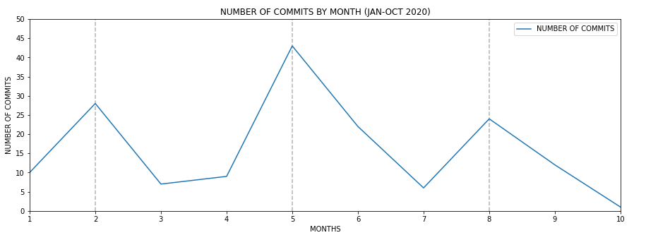
Figure 2. Line plot probably showing Taiga release trend during 2020
It’s pretty clear that every 4 months there’s an increase of the number of commits. However taking a look to Taiga’s backend CHANGELOG.md this fact doesn’t correspond to any major release, therefore it should be caused by other reasons.
to show a trend in data over time
Takeaways
-
Use solid lines only.
-
Don’t plot more than four lines to avoid visual distractions.
-
Use the right height so the lines take up roughly 2/3 of the y-axis' height.
Resources
-
Line charts on Wikipedia
-
Line charts on How to Choose the Right Chart or Graph for Your Data
Bar chart
A bar chart normally represents categorical data in the form of bars or columns. The bars could be vertical or horizontal. They are normally used to compare different categories.
The reason of using a bar char in this situation is because I’d like to represent the lines of code of every programming language other than Python used in Taiga’s backend project. To get that type of information from source code I’m using Cloc. Cloc counts lines of code and gives some insight about which language is implied in each source code file. I’m executing cloc and redirecting its output to a csv file.
Getting source code metrics
> cd taiga-back
> cloc ./ --by-file --csv --quiet > /tmp/taiga_cloc_output.csv
Now after uploading the csv file to Jupyter we can then use it:
Reading csv file
import pandas as pd

df = pd.read_csv('taiga_cloc_output.csv', usecols=range(0, 5))
df.head()
If we liked to get the different languages used in the project:
Different languages used in code
df['language'].unique()Getting a ranking of the languages used by number of files sorted in descending order, most used first.
ranking of languages
by_language = (df
    .copy()
    .loc[:, ['language', 'code']]
    .groupby('language')
    .count()
    .reset_index()
    .rename(columns={'code': 'count'})
    .sort_values('count', ascending=False))

by_language
So it’s clear Python is the most used language by far. But putting Python aside how important are the rest of the languages. I’m using a bar chart to show it.
Plot creation
import matplotlib.pyplot as plt
import numpy as np

bar_data = by_language.copy()
bar_data = bar_data.loc[bar_data['language'] != 'Python']

xs = bar_data['language']
ys = bar_data['count']

plt.figure(figsize=(15, 5))

bar = plt.bar(xs, ys, color='gray')

# ADD CHART TITLE
plt.title('NUMBER OF NON PYTHON FILES BY TYPE')

# ADD NUMBER OF FILES ON TOP OF CHARTS
for rect in bar:
    x = rect.get_x() + (rect.get_width() / 2)
    y = rect.get_height()

    plt.text(x, y + 1, y, weight="bold", ha='center', va='center')

# HIGHLIGH MOST PROMINENT LANGUAGE
bar[0].set_color('orange')

# ADD MORE Y TICKS TO GIVE ON TOP NUMBERS SOME ROOM
plt.yticks(np.arange(0, 35, step=5))
plt.show()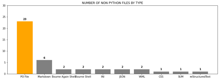
Figure 3. Bar chart showing Non Python files by number of files
To compare different categories
I did another bar char comparing top two committers in a given year to show a more complex use of bar charts. Alghough I’m not showing the code here, you can download the Jupyter notebook attached to this article in the resources area at the end of the article. Here’s the comparison between the two top committers 2015:
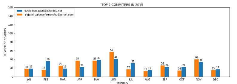
Figure 4. Top 2 committers 2015
Notice how colors are identifying each person along the year, and having the bars side by side helping the reader to compare between both committers.
Takeaways
-
Use consistent colors throughout the chart, selecting accent colors to highlight meaningful data points or changes over time.
-
Use horizontal labels to improve readability.
-
Start the y-axis at 0 to appropriately reflect the values in your graph.
Resources
-
Bar charts on Wikipedia
-
Bar charts on How to Choose the Right Chart or Graph for Your Data
Pie chart
A pie chart is a circular graphic divided into slices representing different parts of a whole. The arch length of each slice represents the percentage of that slice from the entire chart.
With same data as we used in the bar chart example, I’d like to represent the percentage of the Python files vs the rest of the languages. First of all lets read the data again:
read data
import pandas as pd

df = pd.read_csv('taiga_cloc_output.csv', usecols=range(0, 5))
df.head()
Then, because there’re really small categories I’d like to create two groups, Python and the rest of the languages to highlight how big is Python regarding the rest of the languages used in Taiga’s backend.
filtering data
df['is_python'] = df['language'].apply(lambda s: 'Python' if s == 'Python' else 'Non Python')

by_language = (df
    .loc[:, ['is_python', 'code']]
    .groupby('is_python')
    .count()
    .reset_index()
    .rename(columns={'code': 'count'})
    .sort_values('count', ascending=False))

by_language
Once the data is set, I can build the pie chart:
plot creation
plt.figure(figsize=(5, 5))

sizes  = by_language['count']
labels = by_language['is_python']

plt.title('Percentage of Python vs Non Python languages')
plt.pie(
    sizes,
    explode=(0, 0.1),
    labels=labels,
    textprops={'size': 12},
    autopct='%1.1f%%',
    colors=['#68859c', '#ffe76f'])

plt.show()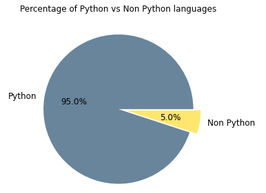
Figure 5. Pie chart showing Python presence vs other languages presence
As we already knew Python is the predominant programming language in this project with the 95% vs the 5% of the rest. In order to see the percentage of the rest of the languages used, I cropped that part of pie and now it can be seen better.
representing different parts of a whole
Takeaways
-
Don’t illustrate too many categories to ensure differentiation between slices.
-
Ensure that the slice values add up to 100%.
-
Order slices according to their size.
Resources
-
Pie chart on Wikipedia
-
Pie chart on How to Choose the Right Chart or Graph for Your Data