


DS - Data visualization 101
When trying to explain some data insights to somebody other than us, it requires, more often than not, some visual representation. The are several types of charts and an even greater number of customizations. It’s important to know which types fit best with the data at hand. Although it seems a pretty straighforward task, there’re plenty of examples of chart misuse, sometimes people had their heart in the right place, but unfortunately, sometimes misleading is done to confuse the viewer on purpose. At least I think it’s important to know if we’re in one group or the other.
Some basic rules
I think the Ten simple rules for better figures by Rougier, Droettboom and Bourne is a good starting point. I’m reviewing each of these rules by making my own good vs bad examples. Although the visualization library I’m using is matplotlib these rules should hold when using any other visualization tool.
Know your audience
The idea behind this rule is that depending on the people we’re targeting we should add more or less information to our charts. It has to do with the context the audience has before seeing the data visualization.
The more the audience is used to the data you’re showing, the less information is necessary to add to the visualization.
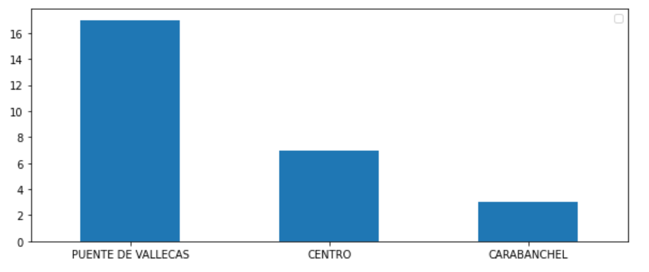
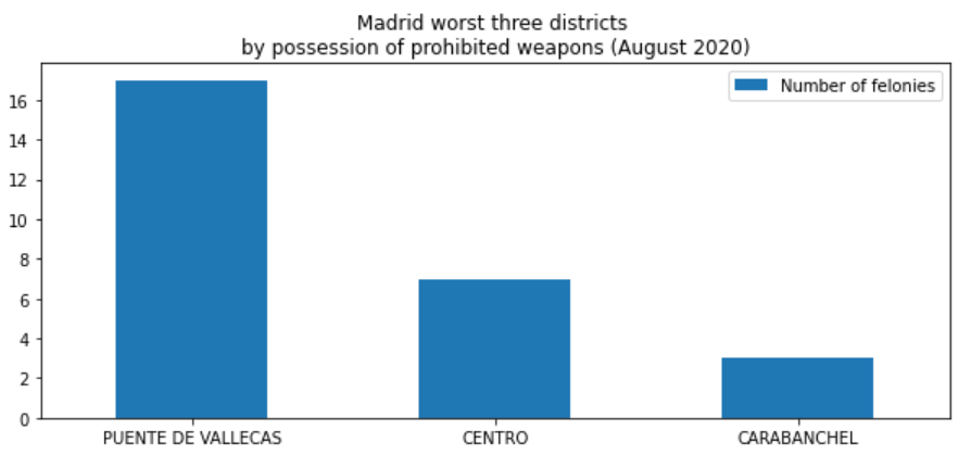
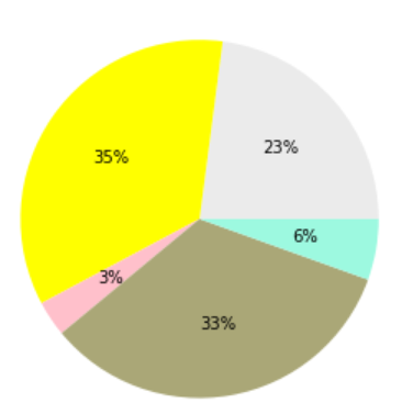
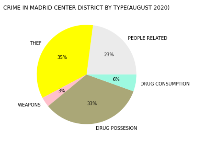
Ok, imagine your boss entering the room with the chart on the left and yelling Have you seen these numbers ? I’m really worried. You may think the man didn’t get his pills on time this morning right ? What are those numbers, what do they mean ? Your boss is showing something to an audience that doesn’t know the context, he didn’t realize that the audience he’s talking to needs more information, more context. If he only had added more information to the chart, maybe you could have had a chance. What about the chart on the right, with more information ?
|
|
Ok now I can understand his concern, I know he lives in PUENTE DE VALLECAS, and he must be worried due to the number of POSSESSION OF PROHIBITED WEAPONS cases in his district. It’s clear that if my boss were a police officer and I was working in the weapons related department I better know what the first chart was about!
Identify your message
The figure must match the idea of the message. So only when the the message you try to express is clearly identified you can think of the best figure expressing that message.
If the figure matches the idea of the message, it will reinforce it.
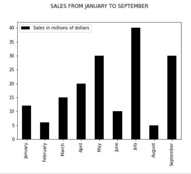
There’re examples about how to represent really complex things in a visualization, but in the end is just a matter of using the chart type that best represents the idea you wanted to communicate. For example, Imagine I’d like to represent the increment of the felonies in Madrid city during the last six months. I wouln’t be doing any favor to the message using for example a pie chart. On the other hand using a line chart could help seeing if the numbers are rising or falling. In the chart on the right I’m using a barchart with a tendency line.
|
|
There is a great article by Jami Oetting that verses on how to choose the right chart depdending on the data you want to show.
Adapt the figure to the support medium
In this case the medium is a blog post that is going to be read by someone in a laptop or a home computer, but tomorrow it could be a big screen in a conference room in front dozens of people. Depending on the medium the amount of information in my figures should be different. If someone is reading a blog post, I can add more details because the reader can stop and review the details at his/her pace whereas in a presentation the slides are going to be shown in a limited period of time. It’s not only about the amount of information, it also about to prioritize which information is most valuable depending on the medium and the time.
People don’t always have the time to look to all the details.
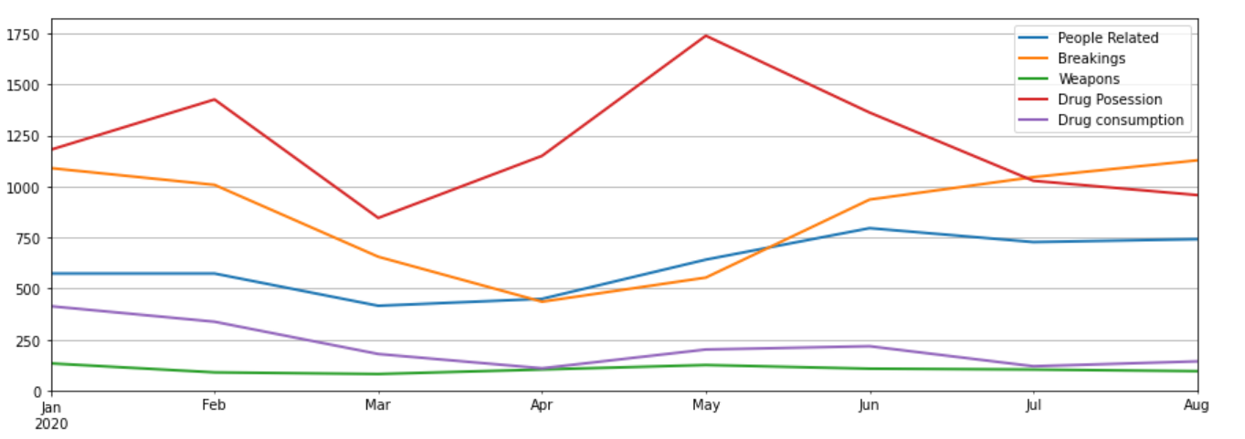
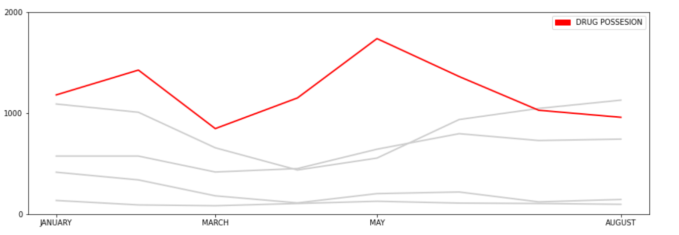
Imagine we were in a room showing the evolution of numbers of drug posession in Madrid from March to August in 2020, using a slide like the one on the left, even people in the first rows could have a hard time figuring out which line is the one we’re talking about. Instead the chart on the right side highlights just the part I want the people to focus reducing the noise.
|
|
Captions are not optional
The caption helps to understand the figure. Imagine a simple pie chart with three areas but with no percentages, no titles telling what the areas represent, that is important information missing right ?
Add the required information to understand what is the intent of the figure without any further explanation.
Another example, the chart on the left has little information, it can’t help the reader to understand what the figure is about, or what the percentages mean. However the chart on the right has the minimum information to express what the chart is about, and what the different areas represent.
|
|
Do not trust the defaults
By default most visualization libraries normally use a subset that can be used in a wider range of cases. Because of that, the default can lack many of important information we’ve been talking about earlier. If that happens we need to learn how to customize the library in order to add whatever additions/changes necessary to create the right message. That could include, adding captions, changing colors, completing axis information, legends… etc.
By default, the defaults shouldn’t be the default! xD
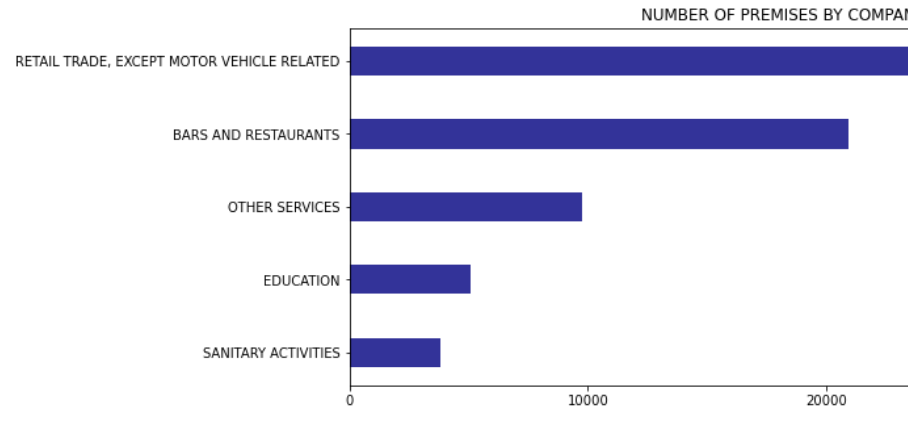
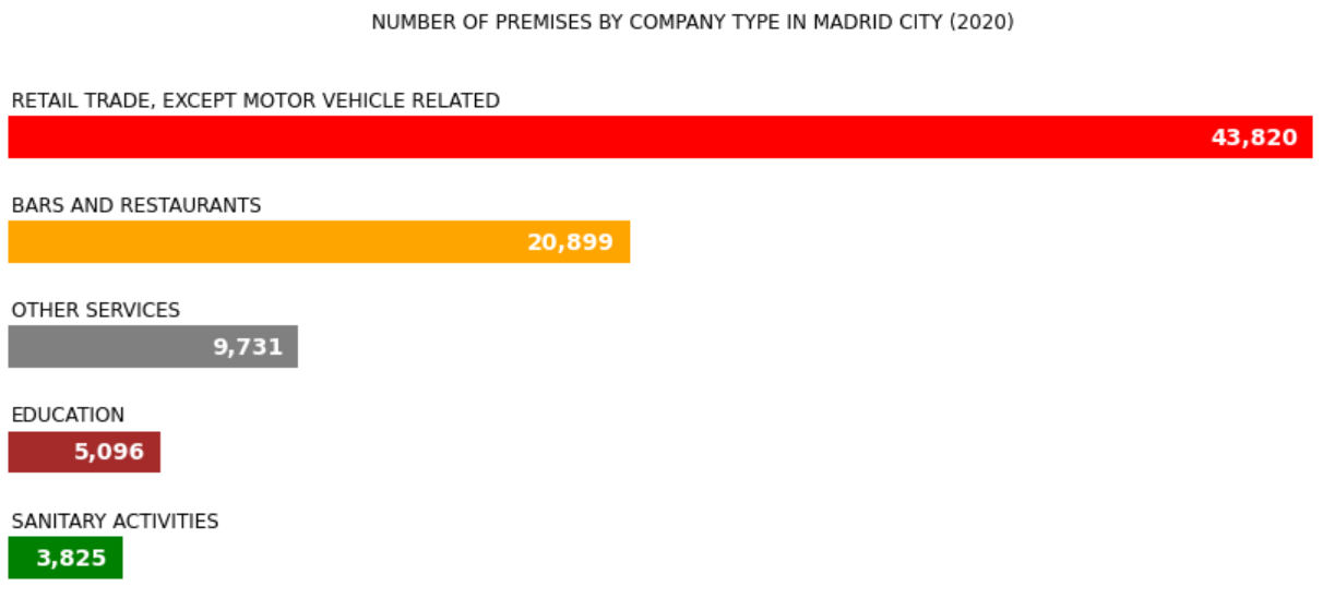
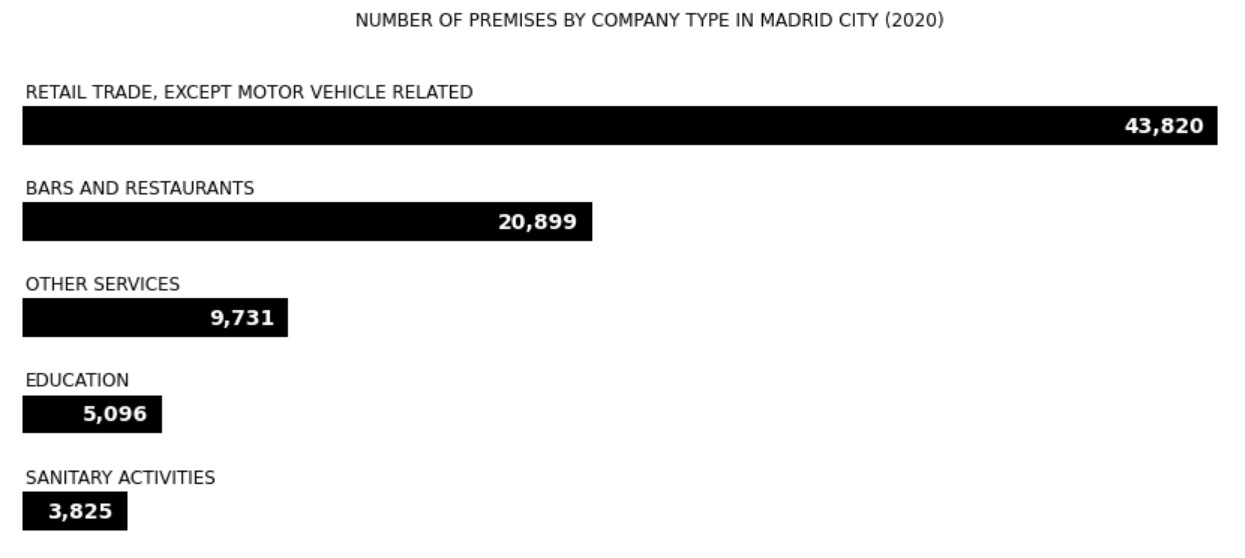
The following example shows how the default horizontal bar plot (left) looks like. It’s not so bad, it has the x-axis but everytime you want to know how many premises a given type has, you have to guess it, and even for the top category the x-axis is a little bit to far. Now on the right, is the same data visualized using a customized horizontal bar plot. Numbers and labels for every type makes a better use of the space. Also colors have been changed to maximize the contrast and make it easier to read. A little bit more about the color in the next section.
|
|
Use color effectively
Using colors wisely could help to enhance your charts, and improve the understanding of the information shown. But it also could lead to a complete disaster misleading your audience from the real message if used wrong. A wrong use of the color could also become a phisical barrier, e.g. if you chose a colormap with low contrast, people with color blindness won’t be able to see the difference between colors.
Colors should mean something, otherwise keep it simple
Following the previous chart, I’m adding colors to it with no special reason, maybe I though it could be more appealing. Look at the chart on the left. Yeah it may look nicer, but the colors don’t add any meaningful value, and a reader could do a wrong interpretation based of the colors: maybe red means danger, green means safer…etc. If the colors don’t mean anything, it’s better to keep it simple like the chart on the right and avoid misinterpretations.
|
|
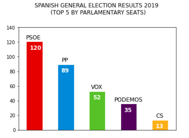
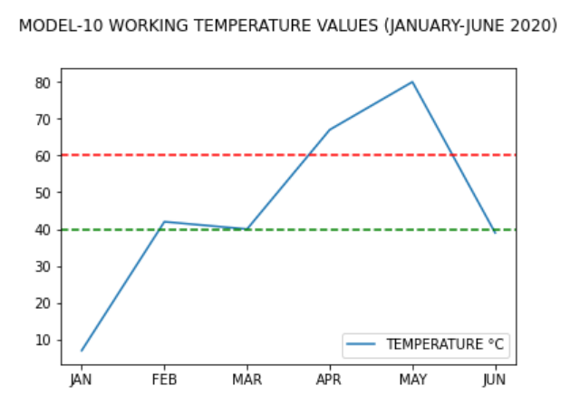
Another practical use of colors in bar charts is to associate categories (could be companies, political parties…) to colors, or setting threshold limits. Here you have two examples of these ideas.
|
|
Do not mislead the reader
Alberto Cairo in his work Graphic Lies, misleading visuals writes about what are the principal techniques used to mislead the reader, or in his words how Becoming a good liar. In his paper Cairo points out three important ideas used to mislead the reader:
-
Hiding relevant data to highlight what benefit us
-
Displaying too much data to obscure reality
-
Using graphic forms in inappropiate ways (distorting the data)
Hiding relevant data to highlight what benefit us
We’ve seen a lot of companies going through difficult times but still showing great figures taken from cherry-picked statistics. These two charts represent the same data, but the chart on the left has cherry-picked the best values leaving bad months out of sight.
|
|
Displaying too much data to obscure reality
If there’s some really bad numbers that someone wanted to hide from the reader, a good technique could be to show the data we’re not interested in showing along with a lot of other indicators. In reality bad numbers will be hidden or minimized under all the rest of noisy data.
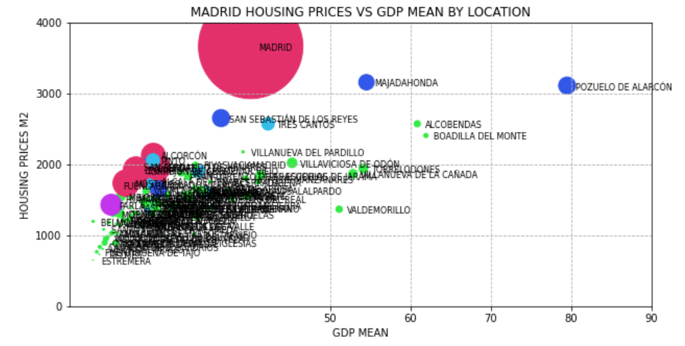
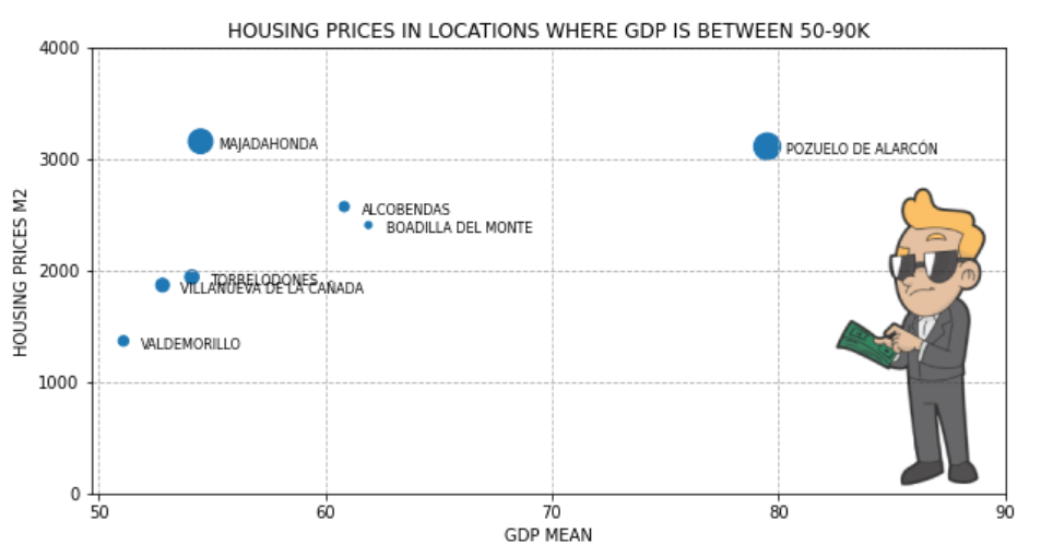
Make the bad numbers to become the needle in the haystack
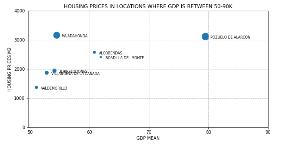
I came up with the following example, I wanted to check how real state market was doing in Madrid towns depending on number of people and the GDP of the people living in the area, and I tried to visualize everything altogether. I realized there’re too many cities inside the area of Madrid apart from Madrid city as you can see in the chart on the left. Therefore the only way of analyzing the data was taking smaller subsets of the data. You can see one of the smaller subsets in chart on the right.
|
|
Using graphic forms in inappropiate ways (distorting the data)
In this category you can find cases where authors are using chart types that were not meant to those cases or cases where the authors are playing with chart configuration in order to bend the reality in their favor.
Look for figure smells, Does it lack information to check whether data is properly shown, or distorted ?
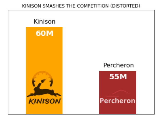
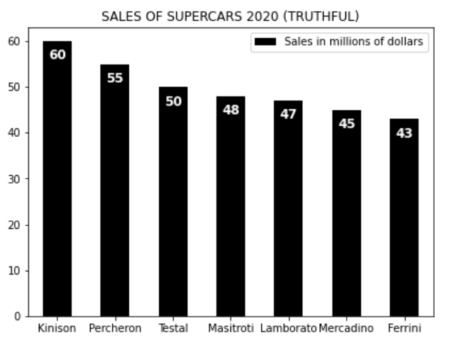
For the next example I made up a few supercar brands competing to each other in sales. Apparently the brand that has sold more cars has created the chart on the left to highlight its superiority over the competition. But if you look at the reality (chart on the right) the competition is not so far away as the want us to believe.
What did they do in order to deceive us ? Well something really simple, they truncated the y-axis to increase the impression that the difference is greater than it really is, and then they hide the y-axis to prevent us from discovering the deception. The only thing that smells wrong is that the common sense is telling us that according to the numbers the difference looks exagerated. The problem is that if you’re a Kinison fan, your critical thinking will be probably on vacation.
|
|
Avoid "chartjunk"
Chartjunk most of the time refers to everything we could add to chart without adding anything useful or meaningful to it. We’ve already seen a good example of this:
Figure 1. Too much data, colors with no apparently meaning
So yes, in general chartjunk should be avoided, but sometimes, chartjunk in the form of infographics has been proved to be useful to memorize the message and the chart itself in the long term as Bateman, Mandryk, Gutwin stated in their paper Useful Junk? The Effects of Visual Embellishment on Comprehension and Memorability of Charts. Judge by yourself, which of the following charts will you remember tomorrow ?
|
|
Message trumps beauty
Sometimes it’s difficult to figure out which chart will fit best our message, and is in these situations when we are tempted to improvise and create new types of visualizations. We can even create a beautiful masterpiece, but before trying to be the next Michael Angelo it’s always better to look whether somebody has already dealt with this problem before, or if maybe something that’s already there could help us with the message we’re trying to send.
The main reason is that there’re tons of scientific documents written by really smart people out there, showing hundreds of ways of visualizing data and it’s very likely that some of these works will fit somehow in our problem if not perfectly. Avoid reinventing the wheel, and remember that people is more likely to have some exposure to pre-existent scientific visualizations helping them to avoid the effort of understanding a new way of visualizing data plus the message behind the chart.
Getting the right tool
Depending on your area of expertise, the medium you’re going to use and the technology you are confortable with, there’re plenty of tools and libraries out there to visualize the data in the way that best expresses the message you’re trying to communicate.
However I would like to differenciate between the concept of libraries and tools. In the present article I’m using Matplotlib which is a Python library for data visualization but it’s been used inside a Jupyter notebook. Jupyter is a tool, but in the sense of a full featured environment where I can integrate the data I’m using with some analitic tools with some visualization libraries to show the result of my findings. Another example of such type of tool could be Weka which is another tool for loading, analyzing and visualizing data, or BeakerX which is the Java version of Jupyter. Of course this section will be incomplete without mentioning the R project, which could be considered as well a full featured data-oriented environment.
Resources
Finally some links to useful resources regarding data visualization.
Article Sources
Here you can find a tar file with all the sources of the examples I did for this article. You should find both the Jupyter notebooks and the data.
Cheatsheets
If you’d like to have like a cheatsheet to quickly know which chart fits best the data you’re trying to communicate, please don’t forget to take a look to these:
Theory
Some papers and posts worth reading:
Examples of bad visualizations
If you’d like to have a laugh watching horrendous or suspicious charts, take a look at these:
Data
Data I’ve used to create the charts in this article:
Visualization libraries
Libraries you can use with your favorite programming language.
Python
I’m sure there’re many more in the Python world but Matplotlib is widely used mainly because its integration in Pandas.
JS
In JS there’re trillions (well maybe not so many) of libraries, but I’ve worked with Echarts a couple of times in the past two years and it has my respect.
Java
I have to say, I haven’t tested any of the following libraries, but I’m looking forward to do it in the future. I just did a couple of searches and I copied the ones that looked up to date.
-
Tablesaw: Java dataframe and visualization library
-
Gral: Free Java library for displaying plots
-
jzy3d: A Java API for 3d charts
-
XChart: is a light-weight Java library for plotting data
-
JFreeChart: A 2D chart library for Java applications
-
JGrapht: a Java library of graph theory data structures and algorithms
-
GraphStream: A Dynamic Graph Library
Integrated Environments for data analysis and visualization
A library alone can’t solve all the problems trying to get some meaningful insights from data, and integrated environment normally does.
Python
The king of the Jungle at the moment:
-
Jupyter: Project Jupyter exists to develop open-source software, open-standards, and services for interactive computing across dozens of programming languages
Java
From the following list, I’ve tested BeakerX which is, keeping long story short, a Jupyter environment with the possibility of using a JVM language in your notebooks. I also know Weka which is also an integrated environment for data analysis however nowadays is more focused towards machine learning.
-
BeakerX: BeakerX is a collection of kernels and extensions to the Jupyter interactive computing environment. It provides JVM support…
-
Weka: It is widely used for teaching, research, and industrial applications, contains a plethora of built-in tools for standard machine learning tasks
-
Dex: The Data Explorer — A data visualization tool written in Java/Groovy/JavaFX capable of powerful ETL and publishing web visualizations
-
DataMelt: is a free software for numeric computation, mathematics, statistics, symbolic calculations, data analysis and data visualization