import yfinance

(yfinance
    .Ticker("UA")                # interested in UA
    .history(period="1y")        # downloads last year
.to_csv('/tmp/ua_1y.csv')) # saves de DataFrame as a csv fileDS - Basic stocks charts
A good way of practicing matplotlib is trying to mimic examples out there. Trading is one of those areas where charts are broadly used. I’ve checked several articles (I’ll leave the reference in the resources area) to see which ones are the most popular and then try to reproduce them using matplotlib and maybe learning something about stock analysis in the process.
All the examples in this article have been created using a Jupyter notebook. You can find the source code of the notebook here.
A little bit about indicators
After spending an hour trying to get a simple listing of what are the most common financial indicators, I kind of came up with the following summary. There’re two main types of financial indicators, lagging indicators and leading indicators. Lagging indicators are normally used by traders to know when to enter or exit a given value, whereas a leading indicator would normally used to guess where the prices of a given stock are going to go.
I’ve also found another classification based on the required information the trader needs at a given time of the process, here’s a summarized table:
| TOPIC | TYPE | CHART | EVALUATES… |
|---|---|---|---|
Trend |
LAGGING |
how the market is moving (up, down, stays still) |
|
Mean |
LAGGING |
how far the price is going before changing direction |
|
Relative strength |
LEADING |
oscilations in buying and selling pressure |
|
Momentum |
LEADING |
the speed of price change over time |
|
Volume |
LEADING / LAGGING |
whether traders are cautious or greedy |
Getting the data
Yfinance is a Python library which uses the Yahoo Finance API to access stock related information. There’re thousands of stock values out there, in this ocasion I’m getting Under Armour last year values.
Getting last year data
Then I’m creating a Jupyter notebook where I’m importing the csv to analyze the data and create the chart with the indicators.
loading csv with stock prices
import pandas as pd

ua = pd.read_csv('ua_1y.csv')
ua.head()
First I’m creating a line chart with all the loaded prices:
stock prices with matplotlib
import numpy as np
import matplotlib.pyplot as plt
import matplotlib.dates as mdates

xs = pd.to_datetime(ua['Date'])
ys = ua['Close']

def base_plot():
    plt.plot(xs, ys)
    plt.title('UNDER ARMOUR STOCK PRICES (OCT-2019 - OCT-2020)')
    plt.ylabel('PRICE (US Dollars)')
    plt.yticks(np.arange(np.floor(ys.min()) - 2, np.ceil(ys.max()) + 4, step=2))

    xaxis = plt.gca().xaxis
    xaxis.set_major_locator(mdates.MonthLocator())
    xaxis.set_major_formatter(mdates.DateFormatter('%b'))

    plt.margins(x=0)

base_plot()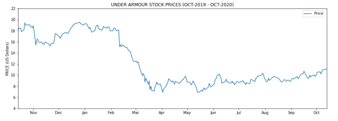
Figure 1. Line chart showing only stock prices (YDT)
Resources
Trend: 50 and 200-day EMA
Following the table I mentioned in the beginning, I’m starting to draw both the 50 and 200-day EMA to see how the market is behaving about this stock value. EMA stands for exponential moving average and it’s supposed to be more responsive than the simple moving averages. Depending on whether we’re looking for medium of long term we would be using the 50 or the 200 days EMA.
How to calculate the EMA using Pandas ? Well, there’s the ewm function to precisely calculate functions in an exponential window. So
calculating 50 and 200-day EMA
ua['EMA 50']  = ua['Close'].ewm(span=50).mean()
ua['EMA 200'] = ua['Close'].ewm(span=200).mean()
Then is simply about plotting both dates as x values and EMAs as y values:
drawing EMA-50 & EMA-200
plt.figure(figsize=(15, 5))

# PRICE LINES
base_plot()

# EMA LINES
plt.plot(xs, ua['EMA 50'], color='green')
plt.plot(xs, ua['EMA 200'], color='red')

# INSERSECTIONS
idx = np.argwhere(np.diff(np.sign(ua['EMA 50'] - ua['EMA 200']))).flatten()
plt.scatter(xs[idx], ua['EMA 50'].iloc[idx], s=200, color='w', edgecolor='black', linewidths=1)

# LEGEND
plt.legend(['Price', 'EMA 50', 'EMA 200', 'EMAs intersections'], frameon=False)

plt.show()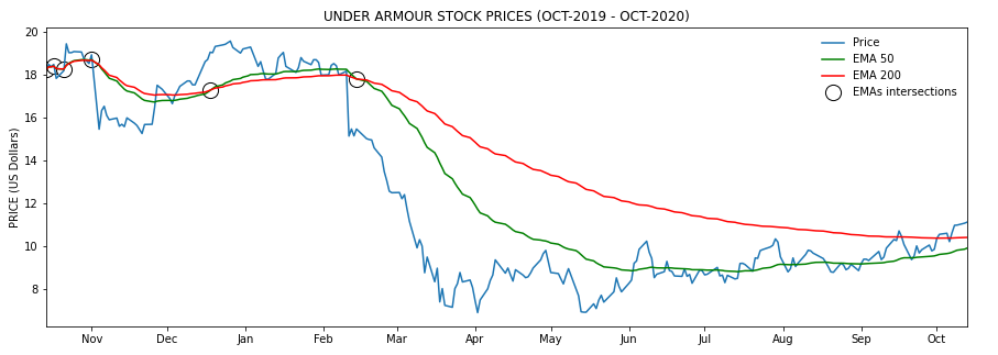
Figure 2. EMA-50 and EMA-200 (YDT)
There’s a few of strategies based on the relationship between the EMA and the price lines, and also between fast and slow EMAs. First it seems that when the price is above the EMA line, the price is likely to go up whereas when it’s below, it’s likely to fall. Because of that EMAs have been also been used visually as support and resistance bands.
But there’s also a relationship worth mentioning, the relationship between the 50 and 200 EMAs. This theory says that when the EMA-50 crosses from below to above the EMA-200 is an indicator that the prices are going to rise. However when the EMA-50 crosses from above to below the EMA-200 it’s an indicator that the prices are going to decrease. I’ve highlighted these intersections in the chart with the following code:
EMAs intersections
idx = np.argwhere(np.diff(np.sign(ua['EMA 50'] - ua['EMA 200']))).flatten()
plt.scatter(
    xs[idx],
    ua['EMA 50'].iloc[idx],
    s=200,
    color='w',
    edgecolor='black',
linewidths=1)Mean: Bollinger Bands ©
One of the most famous indicators in financial analysis is the Bollinger Bands ©. Create by John Bollinger in the 1980s to help traders to know when prices are likely to change direction there’re some indicators. It’s composed by three bands, the moving average (middle band), upper and lower Bollinger bands.
-
typical price: is the average of adding up open, close, and highest price
-
ma is a simple moving average of the typical price (typically for 20 days)
-
n is the number of standard deviations (typically 2)
-
std is standard deviation over a period of time
Figure 3. moving average
typical price, moving average and standard deviation
ua['Typical Price'] = (ua['Open'] + ua['Close'] + ua['High']) / 3

ua['MA 20']    = ua['Typical Price'].rolling(window=20).mean()
ua['STD 20']   = ua['Typical Price'].rolling(window=20).std()
Figure 4. upper bands
upper bands calculation
ua['UpperBol'] = ua['MA 20'] + (2 * ua['STD 20'])Figure 5. lower band
lower band calculation
ua['LowerBol'] = ua['MA 20'] - (2 * ua['STD 20'])Now we can draw the three bands along with the price band:
Drawing Bollinger bands ©
plt.figure(figsize=(15, 5))

base_plot() # PRICE PLOT

plt.plot(xs, ua['MA 20'], color='orange')     # MIDDLE BAND
plt.plot(xs, ua['UpperBol'], color='orange')  # UPPER BAND
plt.plot(xs, ua['LowerBol'], color='orange')  # LOWER BAND

plt.legend(['Price', 'Bollinger Bands'])

plt.fill_between(xs, ua['UpperBol'], ua['LowerBol'], color='yellow', alpha=0.2)
plt.show()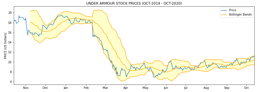
Figure 6. Bollinger upper and lower bands
Here the idea is that when the price is continuously touching the upper band, that’s a signal that the price is overbought, whereas when the price is continuosly touching the lower band that means that the price is oversold:
-
Price overbought: price touching continuosly the upper band
-
Price oversold: price touching continuosly the lower band
There’re more information on how to use this indicator in the resources section.
Relative strength: Stochastic Oscillator (SO)
When measuring the relative strenght of the price we’d like to know if there’s going to be a significant oscillation in the buying or selling pressure. The stochastic oscillator attempts to predict price turning points by comparing the closing price of a stock value to its price range. The formula is:
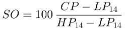
Figure 7. Stochastic Oscillator (SO)
-
SO: Stochastic oscillator
-
CP: Closing price
-
LP14: Lowest price of the previous 14 trading days
-
HP14: Highest price of the previous 14 trading days
In Pandas the only mistery is to calculate the lowest and highest price of the previous 14 trading days and then fill the formula in another DataFrame column.
Calculate lowest/highest price in a 14-day window
ua['L14'] = ua['Low'].rolling(14).min()
ua['H14'] = ua['High'].rolling(14).max()

ua['SO'] = ((ua['Close'] - ua['L14']) / (ua['H14'] - ua['L14'])) * 100
The SO is not meant to be shown over the price plot. You normally see it side by side as a different chart at the bottom of the stock prices chart.
Drawing both prices and SO charts
# DRAWING SO
from matplotlib.gridspec import GridSpec
import matplotlib.patches as mpatches

# GRID TO LOCATE PRICE AND SO CHARTS
fig = plt.figure(figsize=(15, 5))
gsp = GridSpec(2, 1, height_ratios=[4, 3], hspace=0)

ax1 = fig.add_subplot(gsp[0])
ax2 = fig.add_subplot(gsp[1], sharex=ax1)

# PRICE CHART
ax1.plot(xs, ys, label='Price', color="blue")
ax1.set_title('UNDER ARMOUR STOCK PRICES (OCT-2019 - OCT-2020)')
ax1.set_ylabel('PRICE (US Dollars)')
ax1.set_yticks(np.arange(np.floor(ys.min()) - 2, np.ceil(ys.max()) + 4, step=2))
ax1.set_xticks([])
ax1.grid(axis='x', linestyle='--')

# SO CHART
xaxis = ax2.xaxis
xaxis.set_major_locator(mdates.MonthLocator())
xaxis.set_major_formatter(mdates.DateFormatter('%b'))

ax2.plot(xs, ua['SO'], color='red', linestyle='-')
ax2.grid(axis='x', linestyle='--')

# HIDDING LAST Y TICKS IN SO CHART
ax2.set_yticks(np.arange(0, 200, step=50))
ax2.set_ylim(0, 150)
plt.setp(ax2.get_yticklabels()[-1], visible=False)

# COMBINED LEGEND
prices_patch = mpatches.Patch(color='blue', label='Prices')
stocha_patch = mpatches.Patch(color='red', label='Stochastic')
ax1.legend(handles=[prices_patch, stocha_patch])
plt.show()
As a rule of thumb, most of the sources say that values over 80% are considered overbought whereas values below 20% are considered oversold.
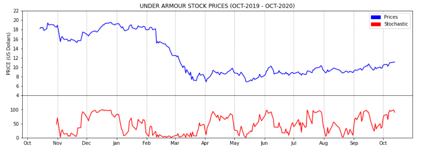
Figure 8. Stochastic Oscillator (YDT)
Resources
Momentum: MACD
The MACD is another trending indicator. It’s the difference between a 12 period EMA minus a 26 period EMA. It’s normally shown together with the MACD SIGNAL and a MACD histogram.

Figure 9. MACD
MACD calculationn
ua['EMA 26']      = ua['Close'].ewm(span=26).mean()
ua['EMA 12']      = ua['Close'].ewm(span=12).mean()

ua['MACD']        = ua['EMA 12'] - ua['EMA 26']
Figure 10. MACD signal
MACD signal calculation
ua['MACD SIGNAL'] = ua['MACD'].ewm(span=9).mean()
Figure 11. MACD histogram
MACD histogram calculation
ua['MACD HIST'] = ua['MACD'] - ua['MACD SIGNAL']Drawing MACD
import matplotlib.ticker as ticker

from matplotlib.gridspec import GridSpec
import matplotlib.patches as mpatches

# GRID TO LOCATE PRICE AND SO CHARTS
sto = plt.figure(figsize=(15, 5))
gsp = GridSpec(2, 1, height_ratios=[4, 3], hspace=0)

st1 = sto.add_subplot(gsp[0])
st2 = sto.add_subplot(gsp[1], sharex=st1)

# USING A NORMALIZED X AXIS TICKS
thex = np.arange(len(ua))

# DRAWING PRICE CHART
st1.plot(thex, ys, label='Price', color="blue")
st1.set_title('UNDER ARMOUR STOCK PRICES (OCT-2019 - OCT-2020)')
st1.set_ylabel('PRICE (US Dollars)')
st1.set_yticks(np.arange(np.floor(ys.min()) - 2, np.ceil(ys.max()) + 4, step=2))
st1.grid(axis='x', linestyle='--')

# DRAWING MACD CHART
st2.plot(thex, ua['MACD'], color='blue')
st2.plot(thex, ua['MACD'], color='blue')
st2.plot(thex, ua['MACD SIGNAL'], color='red')

pos_his1 = ua.loc[ua['MACD HIST'] > 0.2]
pos_his2 = ua.loc[(ua['MACD HIST'] >= 0.0) & (ua['MACD HIST'] <= 0.2)]

neg_his1 = ua.loc[(ua['MACD HIST'] < 0) & (ua['MACD HIST'] >= -0.1)]
neg_his2 = ua.loc[ua['MACD HIST'] < -0.1]

st2.bar(pos_his1.index, pos_his1['MACD HIST'], width=0.6, color='#77af70')
st2.bar(pos_his2.index, pos_his2['MACD HIST'], width=0.6, color='#ace6cb')
st2.bar(neg_his1.index.values, neg_his1['MACD HIST'], width=0.6, color='#dababa')
st2.bar(neg_his2.index.values, neg_his2['MACD HIST'], width=0.6, color='#b92f2f')

st2.xaxis.set_major_formatter(ticker.FuncFormatter(lambda x, pos: ua.iloc[pos, 0]))

st2.grid(axis='x', linestyle='--')
plt.show()
Figure 12. MACD YTD
One way of using the MACD is noticing that when the MACD crosses above the signal it’s telling the traders is a good moment to buy whereas when the MACD crosses below the signal it’s a good moment to sell. Of course this also depends on the trading strategy of everyone.
Resources
Volume: On-Balance-Volume (OBV)
Finally here’s the last indicator to create. The On-Balance-Volume is another trending indicator. It’s normally used to know if there’re many traders jumping in or jumping out of a given value. The formula of the OBV:
Figure 13. OBV
A possible translation of the formula to Pandas would be something like this:
calculating OBV signal
ua['OBV'] = np.where(
    ua['Close'] > ua['Close'].shift(1), ua['Volume'],
    np.where(ua['Close'] < ua['Close'].shift(1), -ua['Volume'], 0)
).cumsum()
Then plotting this with matplolib:
OBV chart
import matplotlib.ticker as ticker

from matplotlib.gridspec import GridSpec
import matplotlib.patches as mpatches
from matplotlib.ticker import FuncFormatter

# GRID TO LOCATE BOTH CHARTS
sto = plt.figure(figsize=(15, 5))
gsp = GridSpec(2, 1, height_ratios=[4, 3], hspace=0)

st1 = sto.add_subplot(gsp[0])
st2 = sto.add_subplot(gsp[1], sharex=st1)

# SHARED X VALUES
thex = np.arange(len(ua))

# PRICE CHART
st1.plot(thex, ys, label='Price', color="blue")
st1.set_title('UNDER ARMOUR STOCK PRICES vs OBV - YTD (OCT-2019 - OCT-2020)')
st1.set_ylabel('PRICE (US Dollars)')
st1.set_yticks(np.arange(np.floor(ys.min()) - 2, np.ceil(ys.max()) + 4, step=2))
st1.grid(axis='x', linestyle='--')

# OBV CHART
st2.plot(thex, ua['OBV'], color='black')

# FUNCTION TO FORMAT MILLIONS
def millions(x, pos):
    'The two args are the value and tick position'
    return '$%1.1fM' % (x * 1e-6)

formatter = FuncFormatter(millions)
st2.yaxis.set_major_formatter(formatter)
st2.xaxis.set_major_formatter(ticker.FuncFormatter(lambda x, pos: ua.iloc[pos, 0]))
st2.grid(axis='x', linestyle='--')
st2.set_ylabel('OBV (M Dollars)')
st2.set_ylim([ua['OBV'].min() - 1000, ua['OBV'].max() + 1000])
plt.show()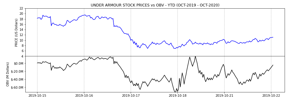
Figure 14. OBV YTD
mplfinance
mplfinance is a matplotlib module specially suited for showing financial data. I didn’t have the time to play with it fully but it seemed to me a very useful tool if you need to plot financial data very often. To use it in the Jupyter notebook:
import mplfinance in the notebook
import sys
!{sys.executable} -m pip install mplfinance
For example to see how easy is to create financia data, here’s the required code to show prices (with candlestick mode) and volume chart of the first 50 days. I’ve also included a couple of trending lines.
mplfinance example
import mplfinance as mpl

# it requires the index to be a time series
ua['Date'] = pd.to_datetime(ua['Date'])

mpl.figure()

# adjusting overall styles
style = mpl.make_mpf_style(
    y_on_right=False,
    base_mpf_style='yahoo',
    gridaxis='vertical',
    edgecolor='#666666',
    gridstyle=':')


data = ua.set_index('Date').iloc[0:50]
# almost everything happens within the plot() function
mpl.plot(
    data, # first 30 days
    type='candle',
    volume=True,
    title='UA PRICE AND VOLUME CHARTS (OCT-DEC 2019)',
    style=style,
    figratio=(11,8),
    figscale=0.85,
    figsize=(15, 6),
    mav=(),
    tlines=[
        dict(tlines=[('2019-11-06', '2019-11-13')], colors='r'),
        dict(tlines=[('2019-12-03', '2019-12-08'), ('2019-12-12', '2019-12-18')], colors='g')
    ])

mpl.show()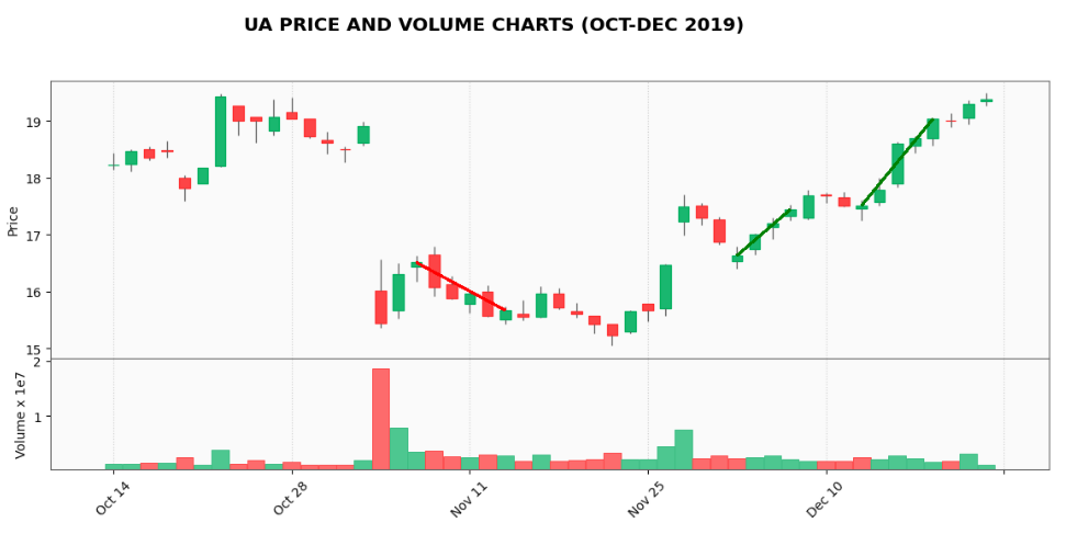
Figure 15. mplfinance example
As you can see the required number of lines is really low compared to previous examples. I think it’s worth spending a little bit more time with it in the future.
Other Resources
Article source code
-
Jupyter notebook: ua_analysis.ipynb.