Model Evaluation: ROC Curve and AUC
In the previous entry I was using decision functions and precision-recall curves to decide which threshold and classifier would serve best to my goal, whether it was precision or recall. In this occassion I’m using the ROC curves.
The ROC curves (ROC stands for Receiver Operating Characteristic) represents the performance of a binary classifier. It shows the relationship between false positive rates (FPR) and true positive rates (TPR). The idea is to choose the classifier that maximizes the TPR. Unlike the precision-recall curves the ideal point in a ROC curve is at the top left corner where the TPR is maximized and the FPR is minimized.
Here I’m using the same dataset as in the previous article and extending the Jupyter notebook with the ROC curves and AUC. There’re a couple of things to keep in mind to understand the following example:
-
I’m using a list of previously trained classifiers (lst variable)
-
I’m using a custom function that uses different decision functions whether they’re available or not (get_y_predict(…))
If you have any doubts about where the example came from you can check the notebook source code at any time.
ROC
import matplotlib.pyplot as plt
from sklearn.metrics import roc_curve, auc

plt.figure(figsize=(5, 5))

for classifier in lst:
    classifier_name      = type(classifier).__name__

    # calculating prediction using decision_function() or predict_proba()
    y_predict            = get_y_predict(classifier, X_test)

    # calculating the roc curves
    fpr, tpr, thresholds = roc_curve(y_test, y_predict)
    plt.plot(fpr, tpr, label=classifier_name)

plt.plot([0, 1], [0, 1], c='green', linestyle='--')
plt.legend(loc="lower right", fontsize=11)
plt.show()
As you can see it seems that the KNeighbors classifier is maximizing the TPR.
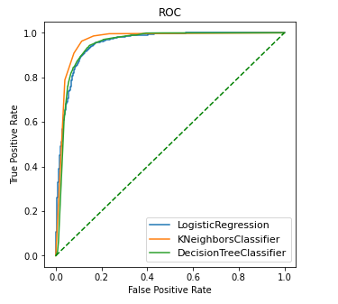
To establish the goodness of classifier is oftenly used as a mesure the AUC or Area Under the Curve. The greater the area under the ROC curve the better is the classifier maximizing the TPR. The KNN classifier was the closest to the upper left corner, lets see the AUC to reasure our suspicions.
AUC
import matplotlib.pyplot as plt
from sklearn.metrics import roc_curve, auc

plt.figure()
_, ax = plt.subplots(1, 3, figsize=(15, 4))
cols  = 0

for classifier in lst:
    classifier_name      = type(classifier).__name__
    # getting decision function prediction
    y_predict            = get_y_predict(classifier, X_test)

    # calculating FPR and TPR
    fpr, tpr, thresholds = roc_curve(y_test, y_predict)

    # calculating the area under the curve
    roc_auc              = auc(fpr, tpr)

    ax[cols].title.set_text("{0} (AUC={1:.2f})".format(classifier_name, roc_auc))
    ax[cols].set(xlabel='False Positive Rate', ylabel='True Positive Rate')
    ax[cols].plot(fpr, tpr, c='k')
    ax[cols].plot([0, 1], [0, 1], c='k', linestyle='--')
    ax[cols].fill_between(fpr, tpr, hatch='\\', color='none', edgecolor='#cccccc')
    cols+=1

plt.show()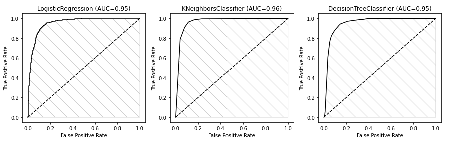
As we see in the picture, the KNN is the one having the biggest AUC rate (0.96), so according to that it’s the one performing the best.
Resources
-
Understanding the AUC ROC curve: from TowardsDataScience.com
-
taiwan.ipynb: Taiwanese companies bankruptcy notebook